He is the designer of Bowie’s albums
Jonathan Barnbrook created the graphic design of David Bowie’s albums until the artist’s death.
Jonathan Barnbrook created the graphic design of David Bowie’s albums until the artist’s death.
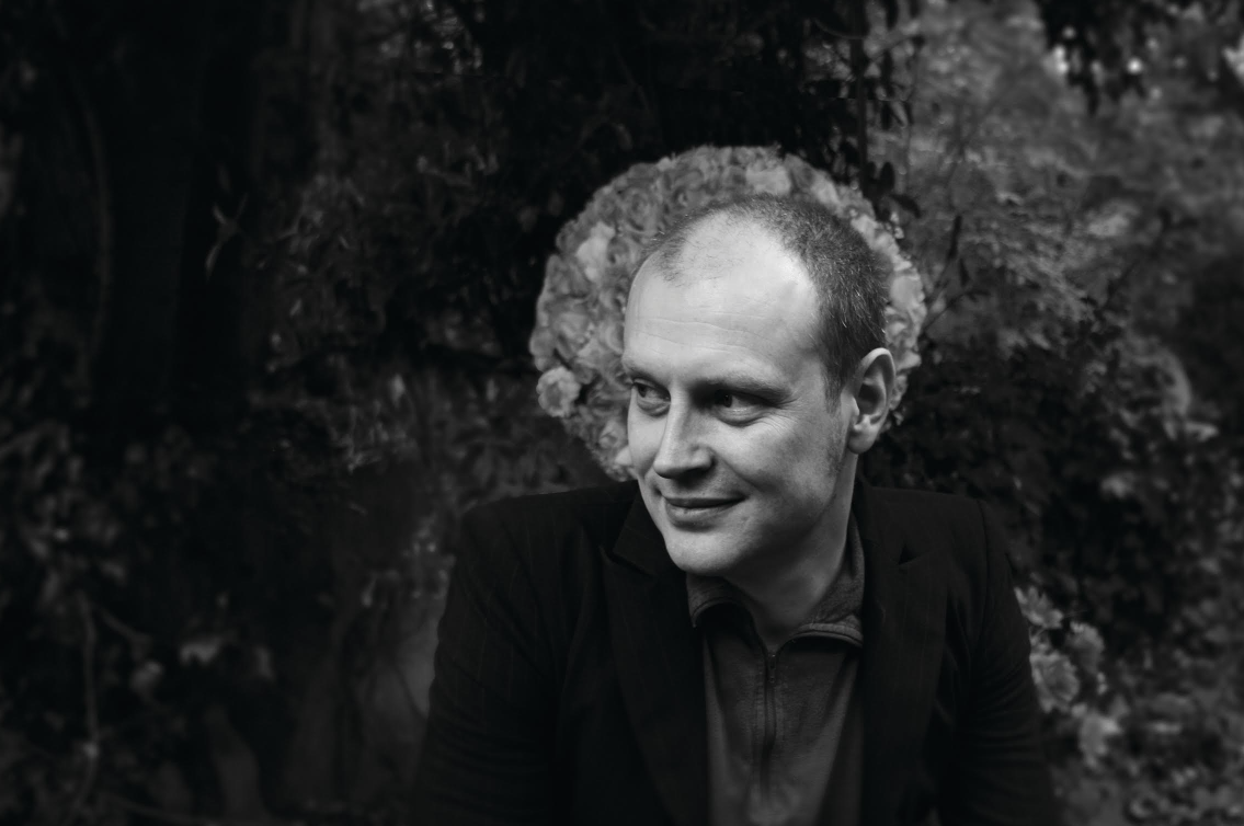
Jonathan Barnbrook makes everyone in the room burst out laughing. At the Harpa concert hall in Reykjavik, Iceland, he is imitating David Bowie’s way of speaking, and he does it very well.
“Better than before,” Barnbrook says, laughing.
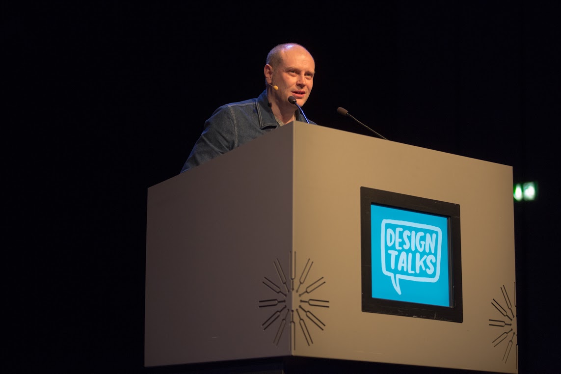
We are in the Harpa VIP room after his lecture for the DesignMarch event. Barnbrook is one of the best known graphic designers in Britain and one of the keynote speakers in this year’s Design Talks.
Barnbrook has had plenty of time to practice Bowie’s idiom because for 15 years he cooperated with the artist who passed away in January. He designed the look of five Bowie albums, including the very last one, The Black Star.
Bowie’s music and especially the Berlin-related albums were very important at a young age for Barnbrook, born in 1966. The most important was Heroes published in 1977.
Album cover art has always impressed Barnbrook and was one of the reasons to his becoming a graphic designer.
“In the 1980s, cover design still played an important role. Now record companies’ marketing departments are too involved,” Barnbrook explains.
He became Bowie’s dedicated designer after his work on a book about Damien Hirst. Before album covers he designed a book about the career of Bowie’s wife Iman Abdulmajid.

“Nobody knew what Bowie was up to”
Barnbrook’s favourite album re-emerged in 2013 in a new format when Bowie published The Next Day after a ten years’ recess.
Its cover presents the black-and-white pose of Bowie from the cover of Heroes. However, the picture is covered by a white block including the album title.
Barnbrook says to have been influenced by constructivist art.
“I developed my design based on the pictures sent to me by Bowie. We came to the conclusion that design can be quite anonymous. People see so many pictures these days that we need simplicity,” he says.
Although the result looks simple and was criticized for that, the design took plenty of time and effort. The music of the albums also influenced the graphic design.
“Bowie did not explain his songs but we discussed them endlessly. We juggled our ideas for a few months to make them click into place. Then he pushed me into creating something on a quick notice and wanted to see the result.”
Working on The Next Day album was kept a secret – a bit of a miracle in the era of social media.
“Nobody knew what Bowie was up to. We kept in touch by email and phone.”
How the album would be received caused both the artist and Barnbrook worry as such a long time had passed since the previous album. Bowie had not given an interview to the media in five years.
When the album finally came out, it made the BBC headlines.

Only a cynical trick?
Bowie’s last album, The Black Star, was published just two days prior to his death. Barnbrook met with Bowie for the last time in June. The artist had seemed positive. Barnbrook did not know then that Bowie had cancer, but the lyrics on The Black Star gave him a sense that it was going to be Bowie’s last album.
“When we sat down for the last time, it was not a grand farewell moment. However, he possibly wanted to meet me because he knew it would be the last time.”
This time, too, Bowie gave Barnbrook complete freedom to design but he did also give the designer a bit of advice.
“Bowie said that the album lyrics were honest and that I should remember that when designing the cover.”
The cover features a simple black star that is very symbolic. It relates to the idea of darkness, mortality, and a black hole that sucks everything.
After Bowie died, these universal themes became personal. In the same way, the death-related lyrics of the title track and Lazarus now sound very different to us.
After Bowie’s death Barnbrook wanted to make the Black Star’s graphic elements freely available to the fans. They are available to download for non-commercial purposes on the internet so that fans can print star-patterned T shirts, for example. At Harpa, Barnbrook showed photos of the stars that Bowie fans have tattooed on their skins.
Barnbrook says to have discussed this with Bowie.
“His representatives were not interested in extra product sales. It was not a cynical trick to market the album. David is gone, so he does not care whether the album sells.”
More than just Bowie
The Bowie collaboration is a significant part of Jonathan Barnbrook’s career, but he has had time to do many other things, too. His company employs six persons to design books, business identities, fonts, websites and magazines. Customers include Roppongi Hills, Mori Art Museum, the Saatchi Gallery, and the Biennale of Sydney.
Barnbrook has worked in many, often politically oriented non-commercial projects. He has worked for the Occypy movement and created anti-advertisements for the Adbusters magazine, including a poster that comments the Absolute vodka brand with Absolute Impotence. This nearly took Barnbrook to court, but eventually the case was dropped.
In addition, Barnbrook’s agency participated in an exhibition at Dismaland, an anti-amusement park created by British artist Banksy.
Barnbrook thinks graphic design is a useful and effective way to protest. Many graphic designers choose the more commercial easier way.
Barbrook thinks that designers not only solve problems but bring them out in the open.
“Graphic designers are not very political people so it is good to remind them. Designers do not usually think that they are responsible for their work, although the situation is now better compared to when I